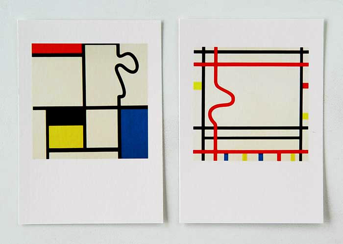
ROB SCHOLTE, untitled, not dated
14,7 x 10,4 cm / 15 x 11 cm
digital print on Soft Textured Natural White Etching Paper Surface
2 cards
published by the artist / Rob Scholte Museum, Den Helder, Netherlands
mint
inv.RSch 000-pr
These digital printed cards based on paintings of Piet Mondriaan slightly vary in size due to hand cut paper. The card on the left depicts a painting of Rob Scholte called “Mondriaan Revisited (New York Boogie Woogie)”, the card showing a painting on the right is called “Mondriaan Revisited 2”.
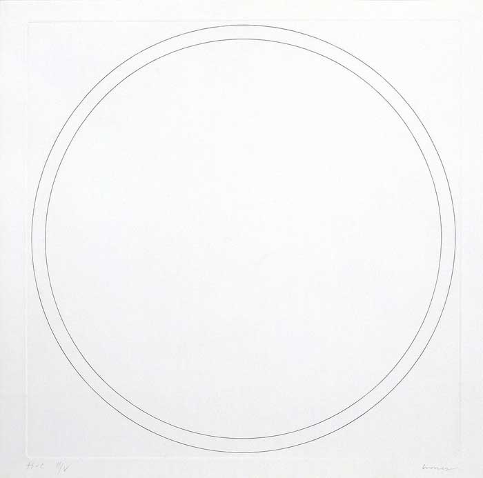
OLIVIER MOSSET, Sans titre, 1995
35 × 35 cm
etching
signed, numbered
edition 150 + 5 HC
published by CEC / Centre d’Edition Contemporaine, Geneva, Switzerland
inv.OM 000
This circle within a circle was etched on a square copper plate. Its blind imprint is barely noticeable since there are no scratches in the non-engraved parts that is so characteristic for common etchings.
The edition was offered to members of the Centre Genevois de Gravure Contemporaine Association in 1995.
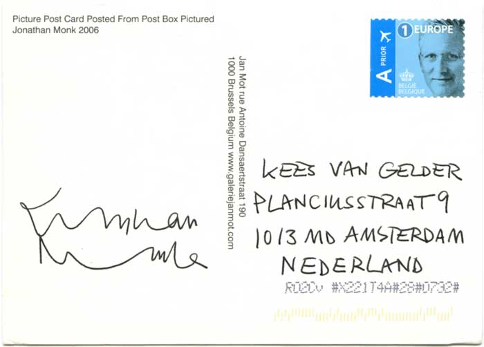
JONATHAN MONK, Picture Post Card from Post Box Pictured, 2006
14,8 x 10,5 cm
post card, stamp [delivered on 2-12-2022]
signed
published by Jan Mot, Brussels, Belgium
inv.JMon 000
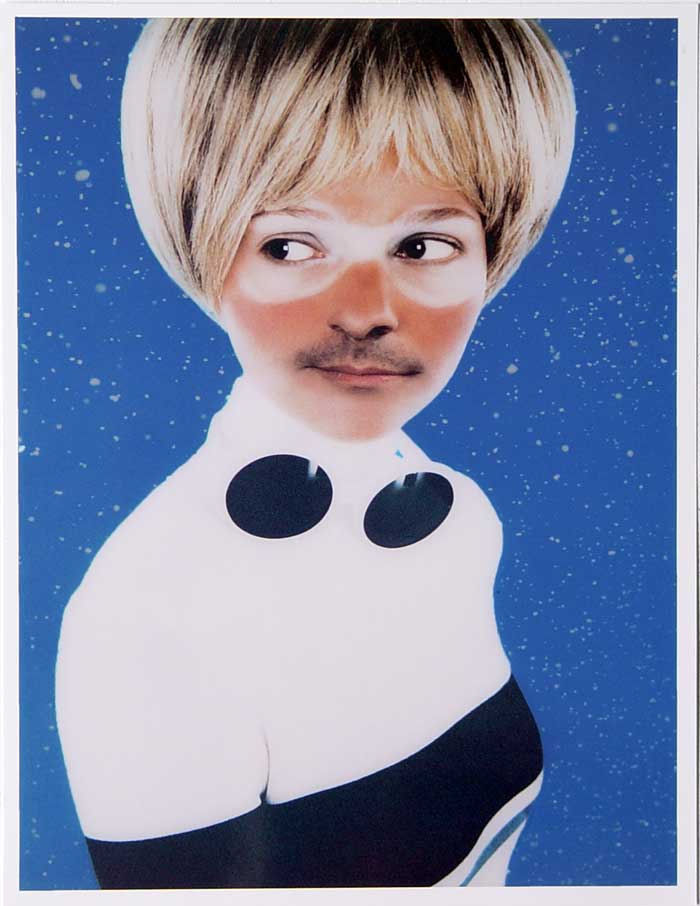
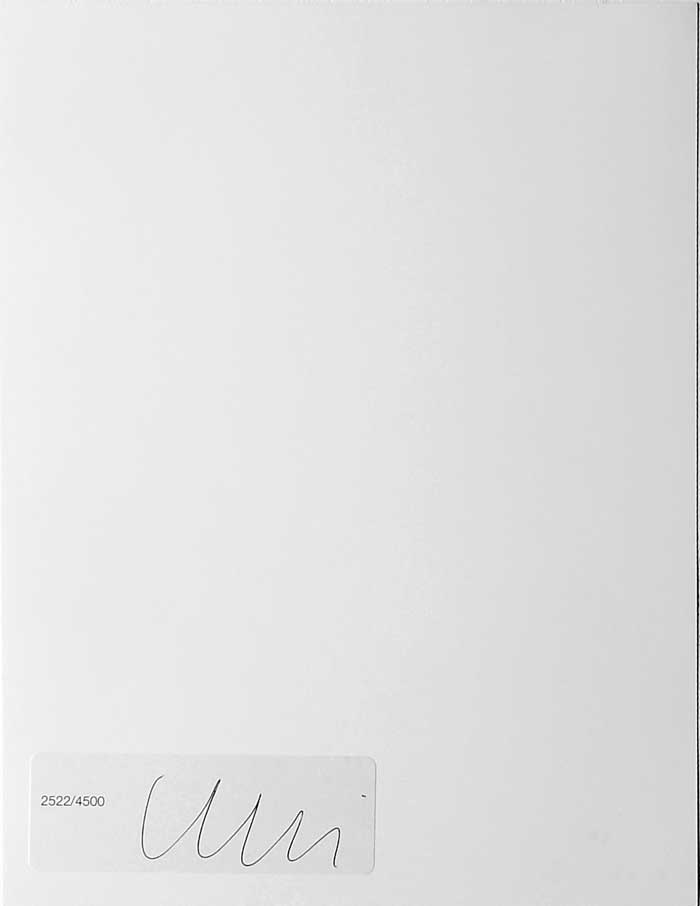
UGO RONDINONE, 2000-2005
colour print
26 x 20 cm hand signed, numbered
sticker at the back of the print is mounted upside down
edition 4500, here number 2522
mint
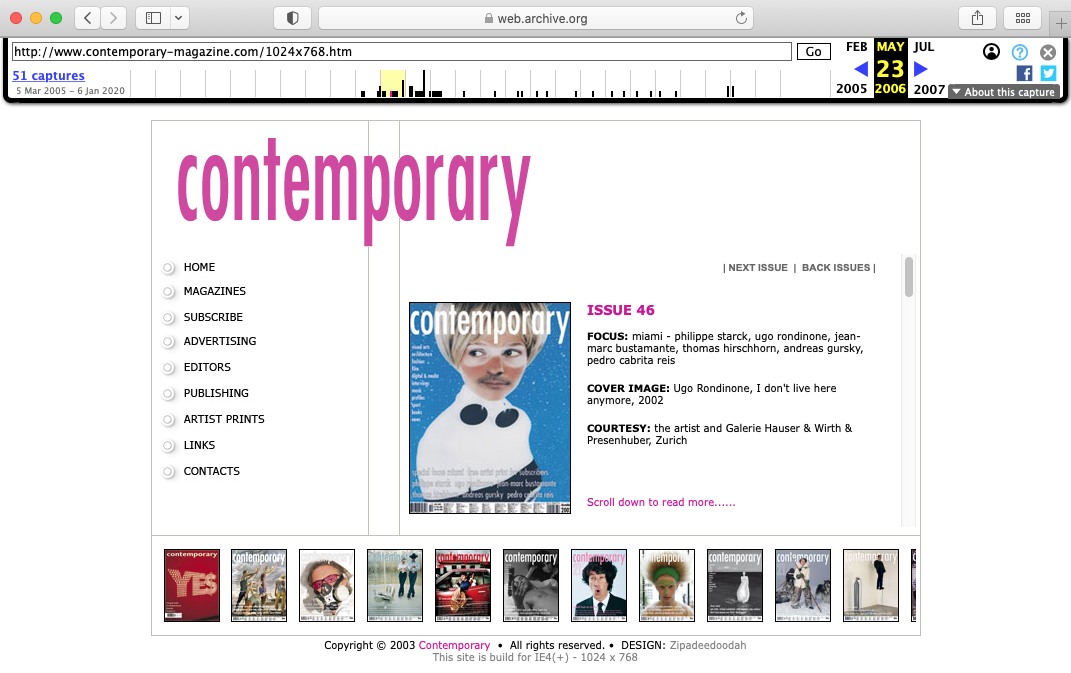
published by Contemporary, London, UK rare
private sale
€ 260,- plus € 12,- Track & Trace registered EU mail
inv.URon 387-pr
Contemporary was a monthly art magazine based in London, founded and edited as The Green Book by Keith Spencer as a quarterly publication. It re-emerged twice, the first time under the title Contemporary Art in 1993 and the second time again as Contemporary in 2002, but not limited anymore to visual arts. Once subscribed to the magazine each issue came with a print, with ink stamped signature and sometimes hand signed on sticker.
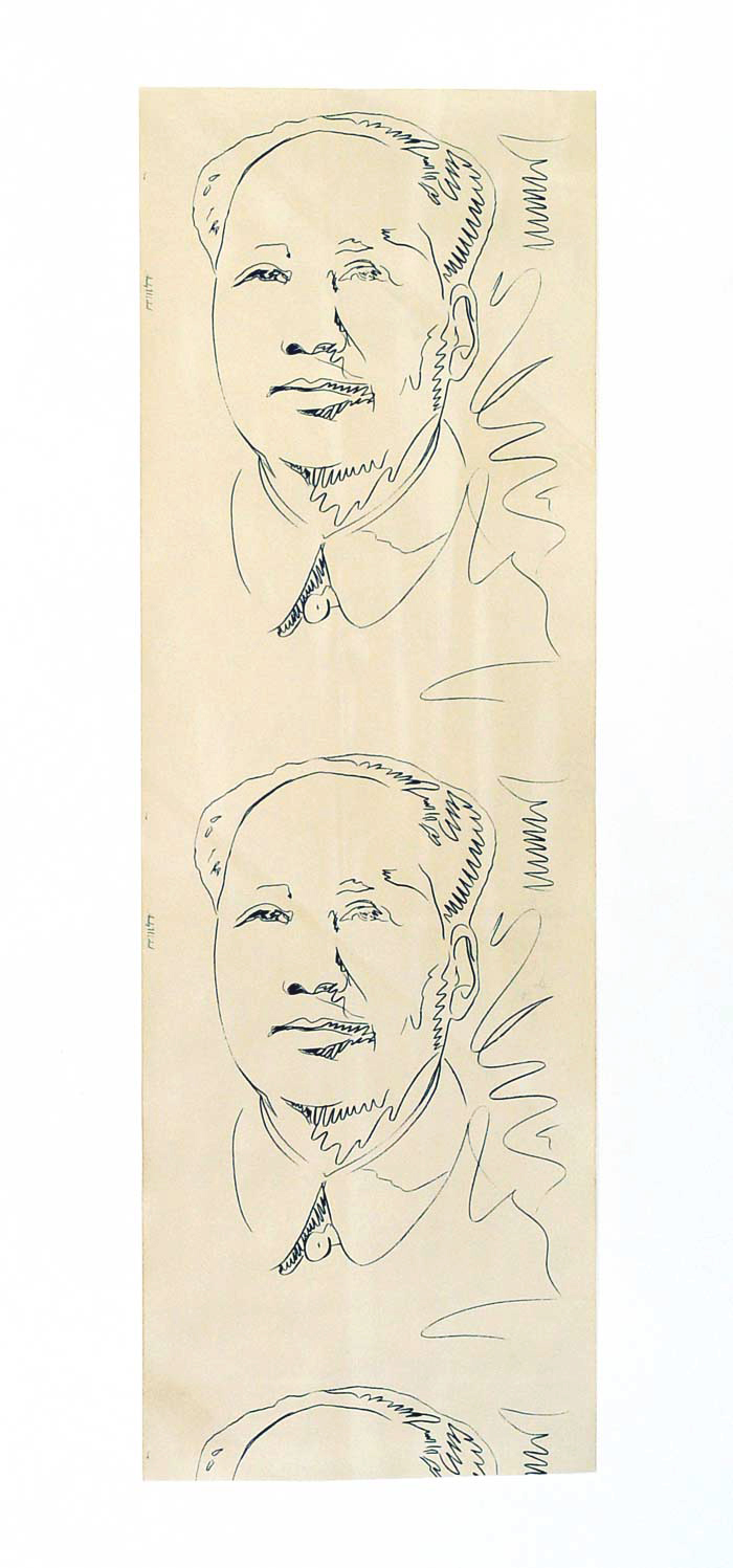
ANDY WARHOL, Mao, 1974
135 x 44,5 cm
screen print, wallpaper with text “Andy Warhol – TRIM”
published by Musée Galliera, Paris, France
condition: fine, although partly hue-like discoloured
€ 850,- plus € 24,- Track & Trace EU registered mail
Wallpaper “Mao” can be found with different texts on the left or right border of the print. Apart from this black and white print colour versions were produced.
Andy Warhol had solo exhibition in Musée Galliera in Paris from 23 February through 18 March, 1974.
History of price:
Sworders Fine Arts Auctioneers, Stanstead, UK 22 August 2023 GBP 580 (hammer price)
DuMouchelles, Detoit MI, USA 16 July 2021 US$ 800.- (hammer price)
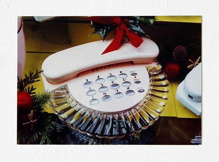
MARIJKE VAN WARMERDAM, Hear there, everywhere, 1989-1990
10,5 x 15 cm
postcard; offset, screen print
published by the artist
Collection K. van Gelder, Amsterdam
inv.MvW 37-39-pr
“In the United States, which Van Warmerdam first visited in 1989, the telephone buttons can be used for both numbers and letters. This led her to replace the meaningless letters with the words ‘Hear, there, every, where’, as though these words can be seen or heard while dialing. The postcard was produced by the artist herself; the four short words are silk-screen printed onto the card.”
From text by Kees van Gelder in catalogue ‘Close by in the distance’ (2011), p. 35.
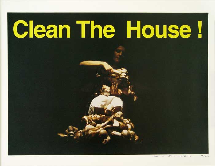
MARINA ABRAMOVIC, Clean The House!, 1994
Out of series; “I Am You”
61,6 x 83,6 cm
screen print on thick paper
signed, dated, numbered
edition 300, here nr 70/100
mint condition extremely rare as numbered and dated
€ 1.060,- plus € 24,- Track & Trace registered EU mail
From one of her performances “Clean The House!” a photo was taken and used for this print on behalf of campaign and group exhibition “I AM YOU” against xenophobia and violence.
In 1997 Marina Abramovic showed “Balkan Baroque” in the MoMA, in New York, for which she made a performance setting including a huge heap of cow bones, soap, brush, dress stained with blood and 3-channel video. Marina Abramovic said about this performance-installation: ‘When the war started in Bosnia, it was so difficult time for me. I was not there. I was living since long time outside of the country. And I remember so many artists immediately react and make the work and protests on the horrors of that war. And I remember that I could not do anything. It was too close to me.’
‘The whole idea that by washing bones and trying to scrub the blood, is impossible. You can’t wash the blood from your hands as you can’t wash the shame from the war. But also, it was important to transcend it, that can be used, this image, for any war, anywhere in the world. So, to become from personal there can be universal.’
The publisher of this screen print is unknown. A signed and numbered copy is in the collection of SMAK, Antwerp in Belgium.
History of price:
Royal Academy of Arts, London, UK October 2023 GBP 1,500.- (not dated, not numbered)
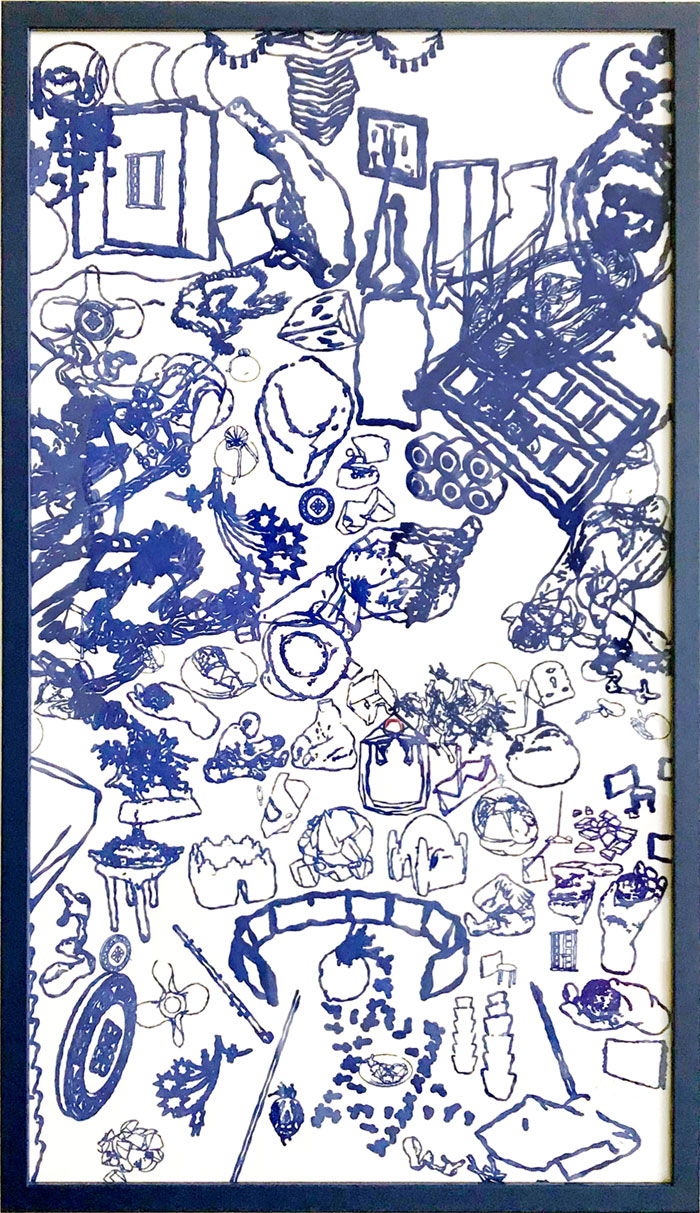
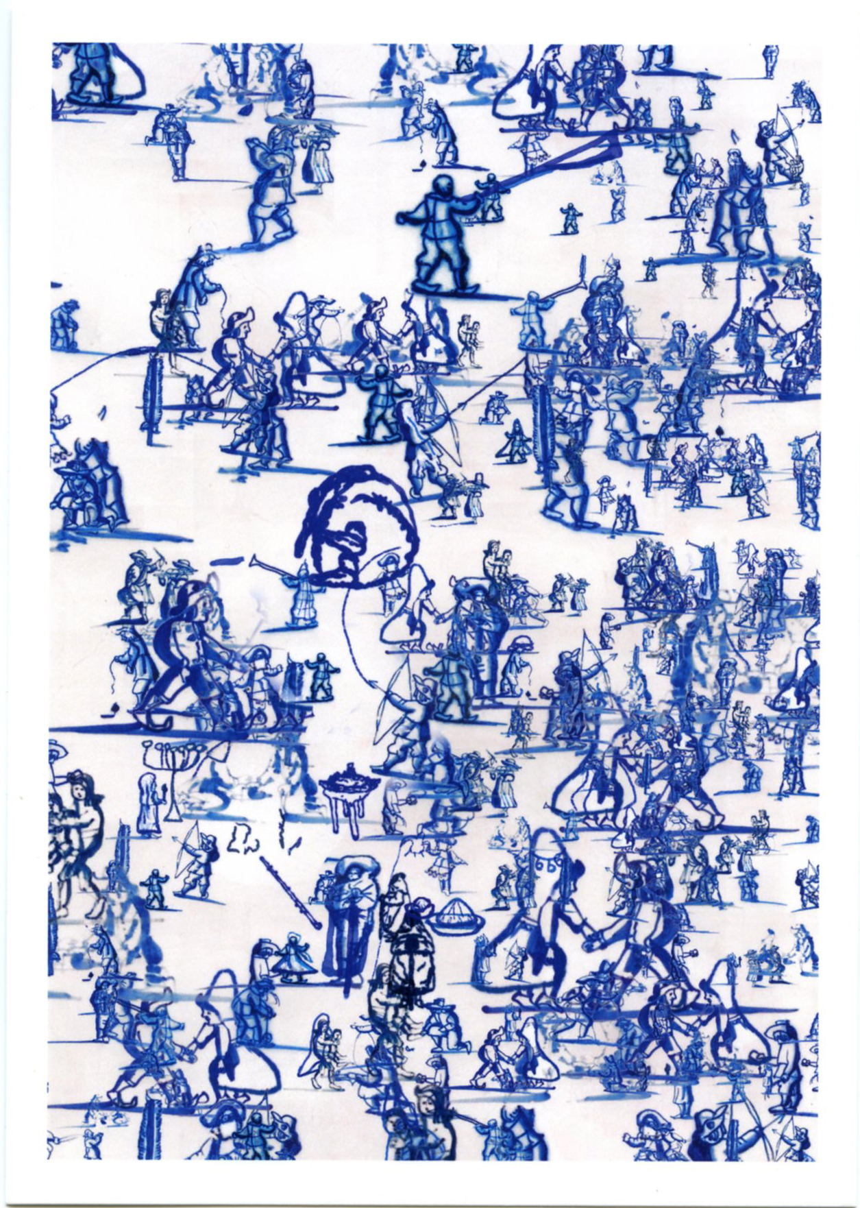
SALIM BAYRI, Let the blue in, 2018
64, 5 x 37 cm
screen print, blue frame + link to AR app for Android
signed, dated, numbered
edition 8
€ 500,- plus € 32,- Track & Trace EU registered mail
When an AR app belonging to this work is held in front of the framed screen print another image appears, though similar in atmosphere. Salim Bayri tells the following about this print:
LET THE BLUE IN (REJECTED), print on paper and AR app, 2018.
I applied to an open call by Spaces. (A company that offers coworking spaces around the world). They wanted to celebrate their 10th anniversary picking 10 existing works by 10 artists to make 10 editions of each that will go to 10 different coworking spaces. It was called ‘Power of 10’.
At that time, I visited the kitchen at ‘Ons Lieve Heer op Solder’ one of the remaining secret churches from the 17th century. I was intrigued by the blue tiles and started to wonder why they were blue.
Blue like the famous deep blue from Essaouira and Touareg garments. Could that be from there?
I made an image out of the figures found in the tiles, mostly about children’s games and made it look as if I really printed and framed it thanks to 3D computer simulations.
They liked it and I was asked to produce 10 copies of the image.
Every morning in my squat house in Van Schendelstraat in Groningen I would look at the image and change little details. I couldn’t leave it like it was after a night of sleep seeing little children playing the ball in my head.
By the time I sent the image to the printers, it was quite different, although I thought it was still in the same spirit.
The day they received it and hung it; I received a call from the organisers surprised by the modified image. “It’s not what we saw and It’s too late to reprint it, the opening is today!”
Urgently, I go see Kees van Gelder to seek some comfort. An hour before the opening we have the idea of using some tech magic with an AR app I made before. When the camera is pointed to the new rejected print, the first approved one shows up instead. I thought they would find it funny enough to accept the new image. But something approved apparently should stay like it is, and I had to reprint and replace everything as it was agreed in the first place.
But well, at least there’s a side of the story where the rejected and approved, old and new, altered and original are together. You have it.
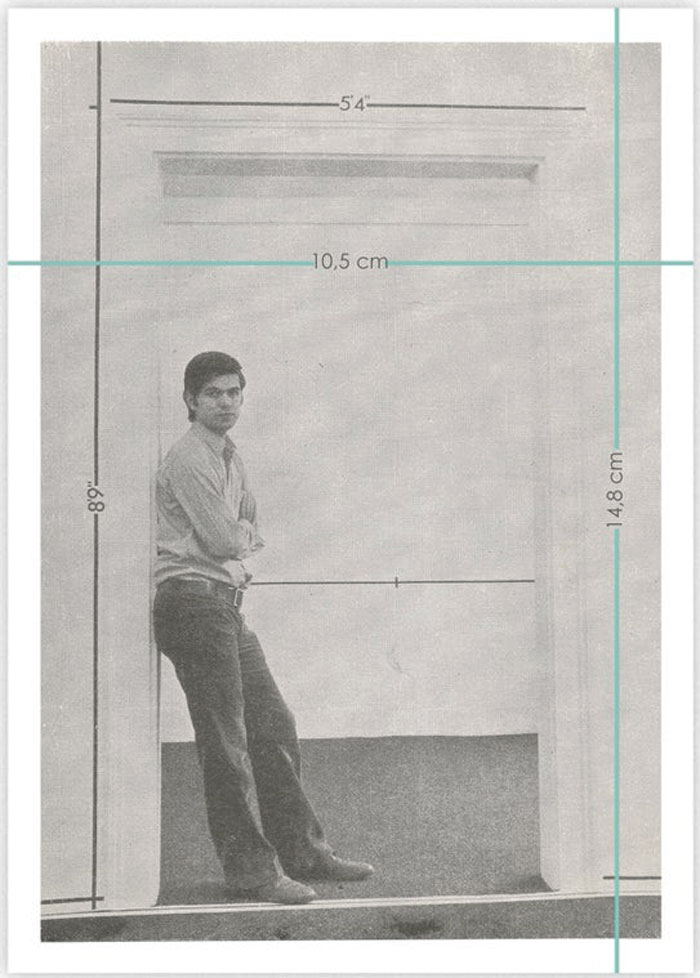
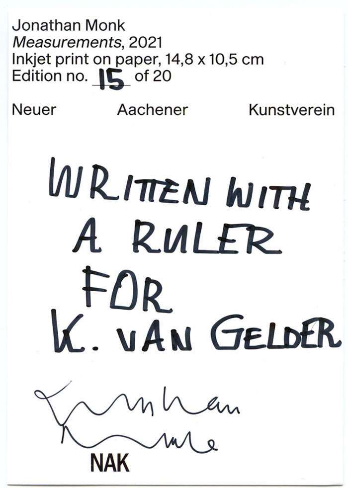
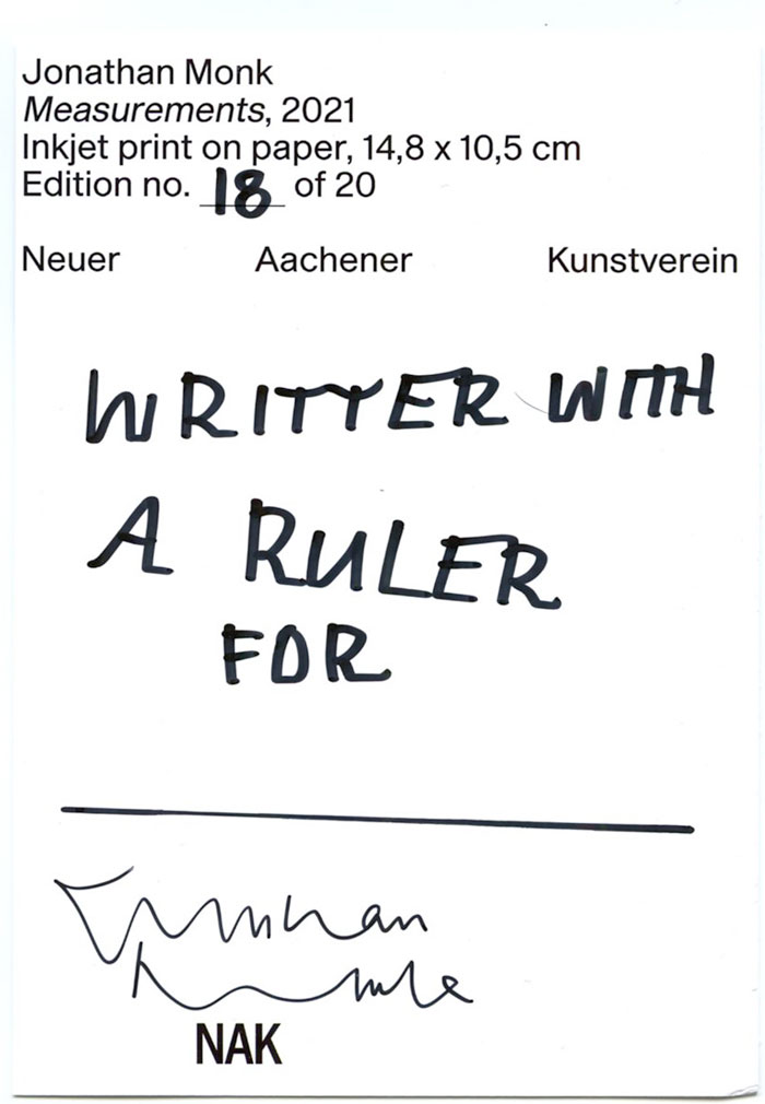
JONATHAN MONK, Measurements, 2021
14,8 x 10,5 cm
offset, felt pen ink, postcard with hand written text
signed, numbered
edition 20
published by NAK / Neuer Aachener Kunstverein, Aachen, Germany
inv.JMon 1110_1113
In 1969 Mel Bochner became renown for his “Measurement rooms” for which architectural features of a room were measured and marked out directly onto the walls. Jonathan Monk is known for reproducing art works taken from art history, i.e. (re)making the same work, but in a different way. For “Measurements” (2021) Monk has marked in green printed lines the height and width of a postcard depicting the view of a “Measurement Room”. On the backside of the card he wrote with the help of a ruler, as a straight line support: ‘Written with a ruler for …’ giving this work a hand made touch. KvG
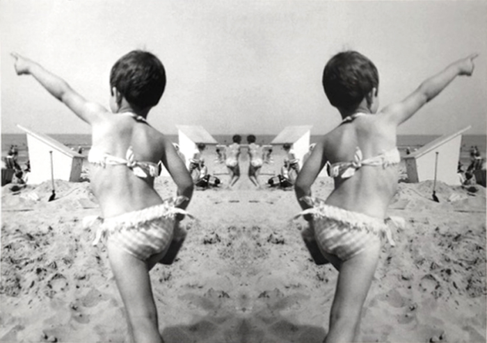
MARIJKE VAN WARMERDAM, Daar is de zon / There is the sun, 2021
42 x 21,7 cm
digital print on matte paper
signed, numbered
edition 20 + 10 AP
published by More Publishers, Brussels, Belgium
Repetition and doubling is one of the favorite motives Marijke van Warmerdam applies in her films and photo works. In this print a picture from her childhood shows her energetically pointing into the air.
“There is the sun” is characteristic for Van Warmerdam’s way of thinking when it comes to how things change position in past, present and future. It is one of her recurring main themes, i.e. anticipating on what comes and reflecting on what happened before. Here Marijke van Warmerdam mirrored a snapshot taken during her early years. Due to its doubling it seems that the child refers to the sun’s changing position in time.
KvG