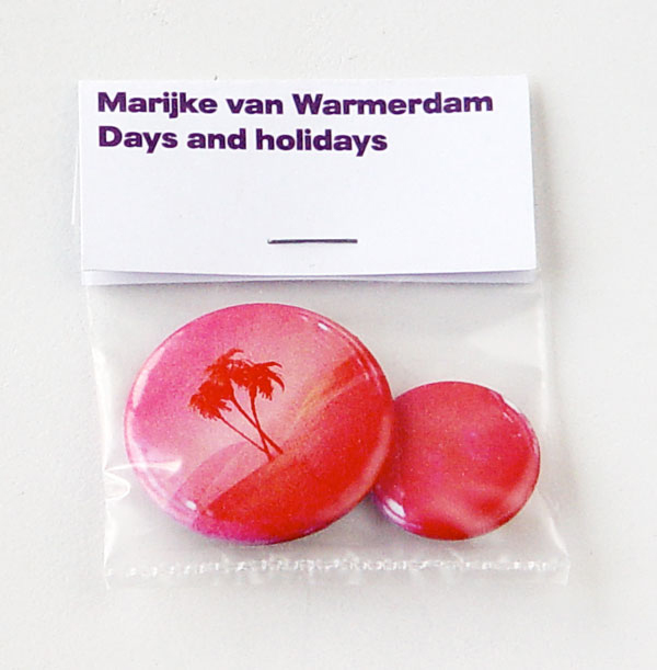
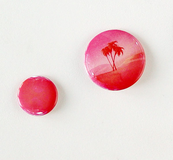
MARIJKE VAN WARMERDAM, Days and holidays, 2006
3,8 cm / 2,5 cm
badges in plastic bag, stapled print on paper, 2 parts
edition 250
published by IKON Gallery, Birmingham, England
€ 85,-
When Marijke van Warmerdam was commissioned to make a badge for the IKON Gallery in Birmingham, she based her design on the spots from a cup and saucer she has used for a mobile with rotating photos called Take a break. She compares a working day to a holiday and so she made two badges representing both kinds of days. The printed light reflections on each badge suggest that the circular form is an air bubble. KvG
Helvetica as Metallica, 2006
wood cut print
49 x 59 cm
edition 20
numbered, signed
printed by David Liaudet, Esbam, Le Mans, France
The inversion of two extremely opposed visual identities. Helvetica is a sans serife font created in 1957 by Swiss graphic designer Max Miedinger (1910–1980) for the Haas Type Foundry in Basel. Metallica is an American heavy metal group formed in 1981 in Los Angeles.
MARIJKE VAN WARMERDAM, In and out, 2006
66 x 100 cm
photo print on black mirror, dibond
edition 5 + 1 AP
published by World House Editions, Middlebury, Connecticut, USA
p.o.r.
“Nature decides the fate of an apple that falls from a tree. Here it falls either on the embankment or in the ditch”. Marijke van Warmerdam, 2011
Quote from catalogue ‘Close by in the distance’, published by Museum Boijmans van Beuningen, Rotterdam.
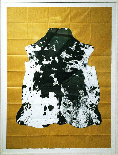
OLIVIER MOSSET, wallpaper, 2006
53 x 100,5 cm / 20.86 inches x 11 yards
edition 100
published by Wallpaper by Artists, Lyon, France extremely rare
mint condition
Private collection, Amsterdam
Margin Scheme
With this plain yellow wallpaper Olivier Mosset continues his exploration of monochromes, a smooth manufactured plane with no more than one colour and its materiality. Although this wallpaper too is meant to be attached to a wall creating a monochrome colour field, here the roll could be looked at as a monochrome sculpture by Olivier Mosset. As a kind of DIY edition quite a few rolls have been used to create a monochrome wall in yellow by Olivier Mosset. Hence quite uncommon.
inv.OM 31
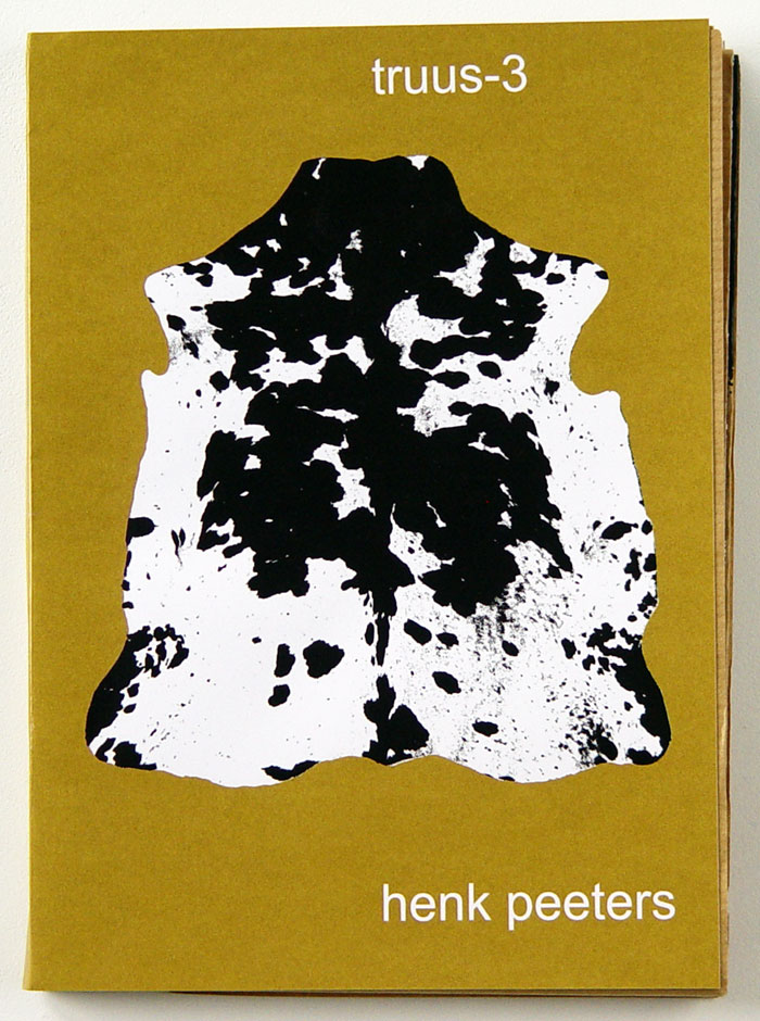
HENK PEETERS, truus-3, 2006
ca 24 x 18 cm, unfolded as issued 120 x 150 cm
offset, screen print
edition 70
signed, dated, numbered (here nr 03/70)
published by PlaatsMaken, Arnhem, Netherlands
EDWARD RUSCHA, City Space, 2006
23.75 x 19.75 inches
colour aquatint with sugar lift flat bite and hard ground etching
edition 30
published by Crown Point Press, San Francisco, USA
not available
Edward Ruscha seems to strip down traffic signs and in general gives order to the barrage of mass media-fed images that assault us on a daily basis. His early career as a graphic artist continues to strongly influence his aesthetic and thematic approaches, as may be shown here in City Space.
History of price:
Crown Point Press, San Francisco, USA € 5,000.- March 2010
EDWARD RUSCHA, Your Space #2, 2006
29.75 x 29 inches
edition 30
colour aquatint with sugar lift flat bite and hard ground etching
published by Crown Point Press, San Francisco, USA
not available
At the age of 18, Edward Ruscha intended to become a commercial painter but found himself drawn to fine art, over time being shaped by three influences: Marcel Duchamp, Pop art, and the movies. Meeting Duchamp when the Pasadena Art Museum hosted the French conceptual artist’s first U.S. show, Ruscha was especially affected by his use of readymade objects and imagery, rendered unfamiliar through unexpected titles or text. He says: ‘When I began painting, all my paintings were of words which were gutteral utterances like Smash, Boss, Eat. Those words were like flowers in a vase; I just happened to paint words like someone else paints flowers. It wasn’t until later that I was interested in combinations of words and making thoughts, sentences, and things like that.’
History of price:
Crown Point Press, San Francisco, USA € 5,000.- February 2010
FRED TOMASELLI, Guilty, 2005
13 x 13 inches
inkjet print, perforated archival paper
edition 100, signed, numbered
published by James Cohan Gallery, New York, USA December 2012
For his works on paper Fred Tomaselli saves New York Times articles and defaces them with paint because some articles have made him angry. Other works on paper utilize the grid form with brightly painted sections and were taken from LSD tabs which usually come in quarter inch perforated squares.
Fred Tomaselli: “In my collages, I use all these images that are made by others. They come through my hands and they end up being something else. You could call me the conductor of these images. There’s something similar about how newspapers operate, with their editors, fact-checkers, photographers, and writers all coming together to spotlight certain things and omit others. They try to present themselves as objective entities, but they are anything but that. I love the idea that in my work I’m just another subjective voice in this subjective world of the news. I become another editor, imposing my editorial acumen.”
MARLENE DUMAS
Lucy, 2005
lithograph,
edition 25
signed, dated + catalogue signed by both artists
+ MARIJKE VAN WARMERDAM
Luciaaaa!, 2005
lithograph, gold leaf
edition 25
signed, dated + catalogue signed by both artists
published by Walther Koenig Buchhandlung, Cologne, Germany
rare, pristine
sold
Photo: K. van Gelder, Amsterdam
linen covered cardboard triptych box
edition number 1/25
Caravaggio’s painting Sepulture of Santa Lucia, which hangs in the Regional Museum of Palazzo Bellomo in Syracuse, prompted Marlene Dumas and Marijke van Warmerdam to make works on the legend of martyr Santa Lucia. Both ‘Lucia’ of Dumas and ‘Luciaaaa!’ of Van Warmerdam is a reproduction in high quality print of one of the works they made for their duo exhibition ‘Con vista al celestiale’ in Syracuse.
Marijke van Warmerdam thought that Lucia’s calling to God and God’s calling to Lucia could best be expressed with the aid of a Jacob’s ladder. She says: ‘A Jacob’s ladder descends from heaven and God calls: “Luciaaaa!” I placed her name in gold letters upside-down on the print, actually as seen through the eyes of God.’
Photo: K. van Gelder, Amsterdam
History of prices:
Sotheby’s, Amsterdam € 5.040,- / $ 6,795.- (incl. premium) 23 May 2007
Phillips, New York $ 3,750.- 1 December 2007